※ 개인적으로 ADP 실기 문제들을 풀이하려고 합니다. 사용 언어는 'R 프로그래밍'입니다.
※ 코드 및 관련 의견 주심 감사하겠습니다.
17회 실기 기계학습 문제 풀이 1편
[17회 실기] 기계학습 문제 풀이 1편
※ 개인적으로 ADP 실기 문제들을 풀이하려고 합니다. 사용 언어는 'R 프로그래밍'입니다. ※ 코드 및 관련 의견 주심 감사하겠습니다. 문제 복기 참고한 사이트 ADP 17회 실기 문제 — DataManim 1-4번
danha23.tistory.com
2-1. 마지막 일자 기준, 인구 대비 확진자 비율 높은 상위 5개 국가 구하기
먼저, 데이터의 구조를 확인한 후 날짜 타입을 as.Date() 함수를 이용하여 변환해주었다.
그리고 마지막 날짜(최근)와 처음 날짜(과거)를 확인하였다.
마지막 날짜는 2021-11-30, 처음 날짜는 2020-01-01이다.
마지막 날짜에서 결측치가 존재하는 변수는 제거하였다.
제거한 변수는 new_tests(검사자)와 new_vaccinations(백신 접종자)이다.
실제 분석에는 필요하지 않은 변수이다.
df <- read.csv('https://raw.githubusercontent.com/Datamanim/datarepo/main/adp/17/problem2.csv', stringsAsFactors = F)
str(df)

head(df)
tail(df)

## 2-1.
library(dplyr)

  ## 날짜 타입 변환
  df$date <- as.Date(df$date)

  max(df$date) # 마지막 날짜(최근)
  min(df$date) # 처음 날짜(과거)

  ## 결측치 존재하는 변수(new_tests, new_vaccinations) 제외
  df <- subset(df, select=-c(new_tests, new_vaccinations))
데이터 전처리를 한 후, 인구 대비 확진자 비율을 구하여 ratio 변수에 넣어주었다.
마지막 날짜(2021-11-30) 기준으로 인구 대비 확진자 비율(ratio)가 높은 상위 5개 국가를 구하였고,
5개 국가는 Montenegro, Seychelles, Andorra, Slovakia, Georgia 순으로 나타났다.
## 인구 대비 확진자 비율 구하기
df$ratio <- df$total_cases / df$population

## 마지막 날짜 기준, 인구대비 확진자 비율(ratio) 높은 상위 5개 국가 구하기
df_date <- df[df$date == max(df$date), ]
df_date_order <- df_date[order(df_date$ratio, decreasing = TRUE), ]
df_top5 <- df_date_order[1:5, ]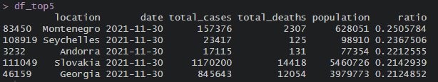
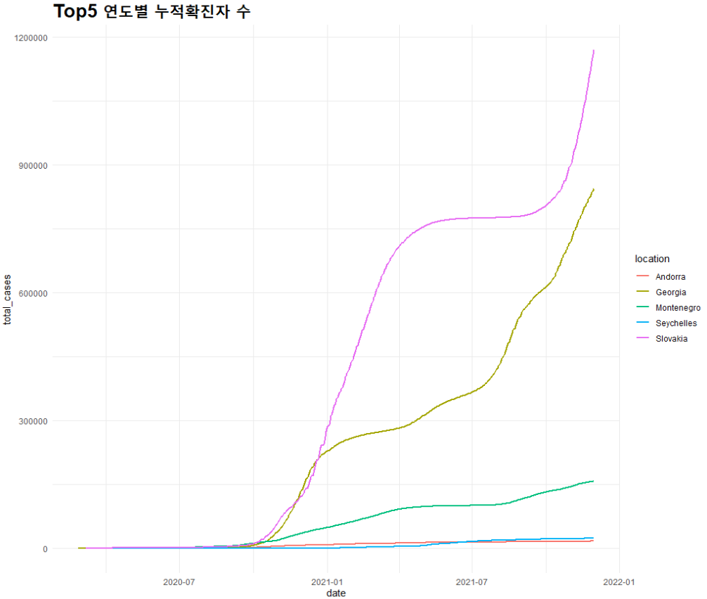
이제 5개 국가에 대한 전체 데이터를 가져온 후 상위 5개 국가에 대한 누적 확진자, 일일 확진자, 누적 사망자, 일일 사망자에 대한 그래프를 범례를 포함하여 나타낸다.
top5_nation <- df[df$location %in% df_top5$location, ]
unique(top5_nation$location)
1) 상위 5개 국가별 "누적 확진자" 및 "일일 확진자" 그래프 (범례 포함)
누적확진자
library(ggplot2)

### 누적 확진자 그래프
top5_total_cases <- top5_nation %>% group_by(location) %>% summarize(sum_cases = sum(total_cases)) %>% arrange(desc(sum_cases))

  ## 막대 그래프: 국가별 누적 확진자
  total_bar <- ggplot(top5_total_cases, aes(x=location, y=sum_cases, fill=location)) + geom_bar(stat='identity')
  total_bar + theme_minimal() + ggtitle("Top5 누적확진자 수") + theme(plot.title = element_text(size=20, face='bold'))

  ## 선 그래프: 국가 및 연도별 누적 확진자
  total_line <- ggplot() + geom_line(mapping = aes(x=date, y= total_cases, color=location), data=top5_nation, lwd=1)
  total_line + theme_minimal() + ggtitle("Top5 누적확진자 수") + theme(plot.title = element_text(size=20, face='bold'))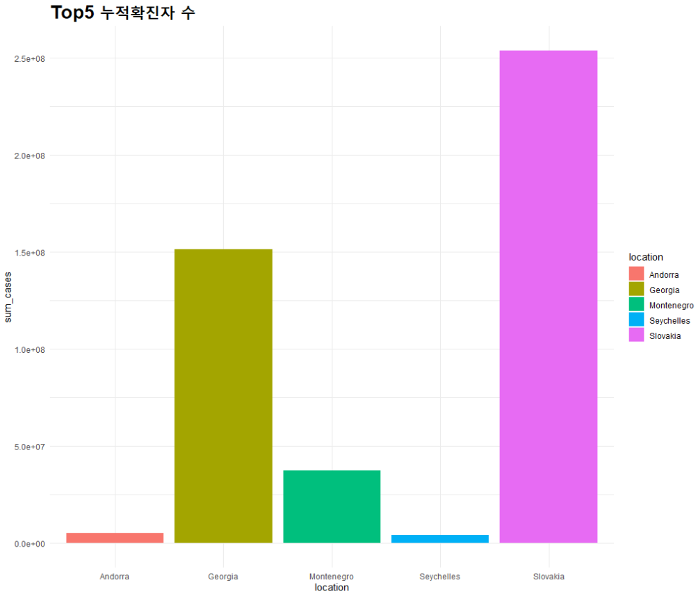
일일확진자
## 일일 확진자 및 사망자 수 구하기
  top5_nation_2 <- top5_nation %>% select(location, date, total_cases, total_deaths) %>% arrange(date)

  ## total_deaths 변수에서 결측치(NA)는 0으로 변경
  top5_nation_2$total_deaths <- ifelse(is.na(top5_nation_2$total_deaths), 0, top5_nation_2$total_deaths)

  ## 일일확진자 및 사망자 수 : 현재-과거 (diff)
  top5_daily <- top5_nation_2 %>% group_by(location) %>% mutate(daily_cases = total_cases - lag(total_cases),
                           daily_deaths = total_deaths - lag(total_deaths))

    ## 1번째 NA는 0으로 변경
    top5_daily$daily_cases[1] <- 0
    top5_daily$daily_deaths[1] <- 0

  head(top5_daily)

  ## 일일 확진자 그래프
  daily_line <- ggplot() + geom_line(mapping = aes(x=date, y= daily_cases, color=location), data=top5_daily, lwd=0.5)
  daily_line + theme_minimal() + ggtitle("Top5 연도별 일일확진자 수") + theme(plot.title = element_text(size=20, face='bold'))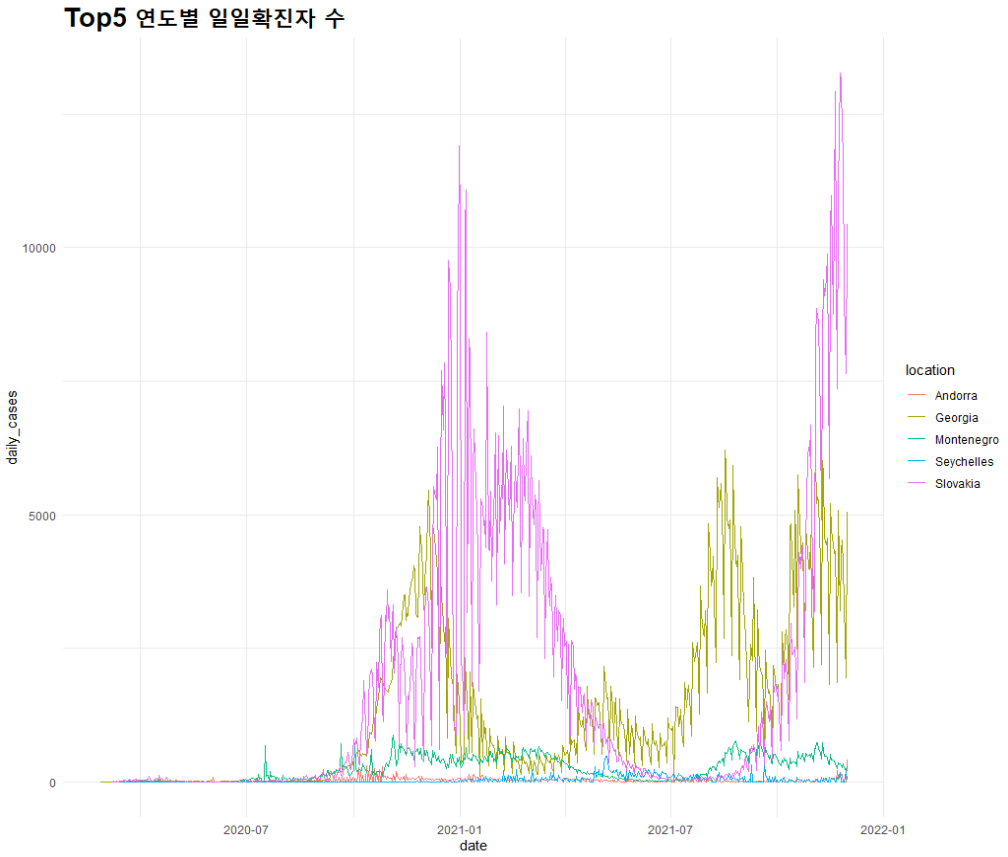
2) 상위 5개 국가별 "누적 사망자" 및 "일일 사망자" 그래프 (범례 포함)
누적 사망자
### 누적 사망자 그래프
top5_nation$total_deaths <- ifelse(is.na(top5_nation$total_deaths), 0, top5_nation$total_deaths)
top5_total_deaths <- top5_nation %>% group_by(location) %>% summarize(sum_deaths = sum(total_deaths)) %>% arrange(desc(sum_deaths))
## 막대 그래프: 국가별 누적 사망자
total_bar <- ggplot(top5_total_deaths, aes(x=location, y=sum_deaths, fill=location)) + geom_bar(stat='identity')
total_bar + theme_minimal() + ggtitle("Top5 누적사망자 수") + theme(plot.title = element_text(size=20, face='bold'))
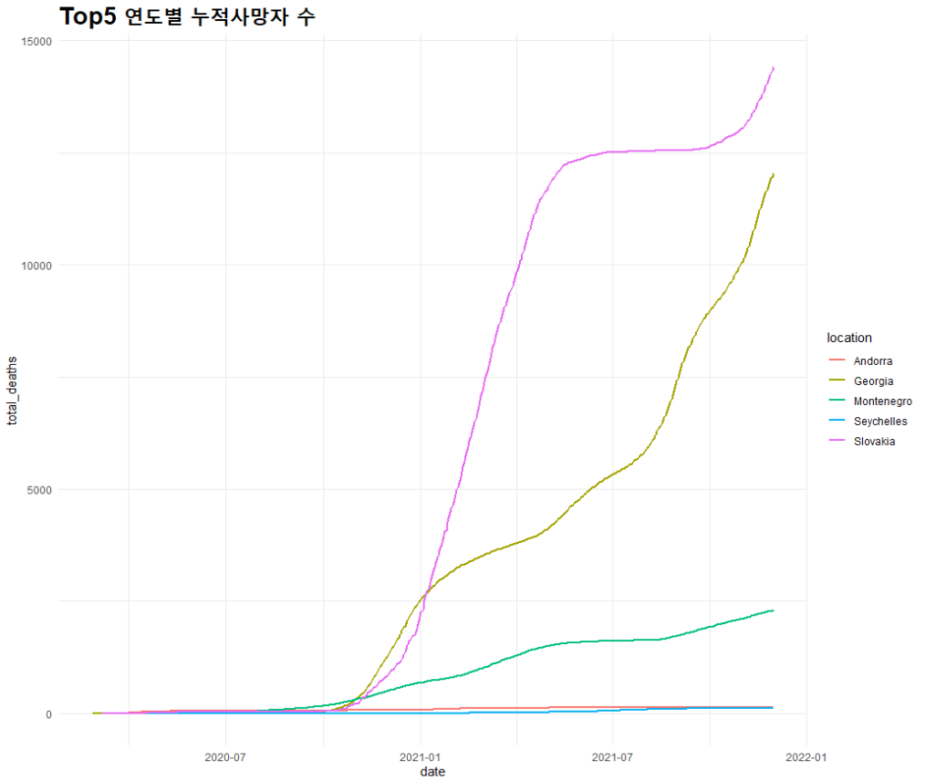
## 선 그래프: 국가 및 연도별 누적 사망자
total_line <- ggplot() + geom_line(mapping = aes(x=date, y= total_deaths, color=location), data=top5_nation, lwd=1)
total_line + theme_minimal() + ggtitle("Top5 연도별 누적사망자 수") + theme(plot.title = element_text(size=20, face='bold'))
일일 사망자
## 일일 사망자 선 그래프
daily_line <- ggplot() + geom_line(mapping = aes(x=date, y= daily_deaths, color=location), data=top5_daily, lwd=0.5)
daily_line + theme_minimal() + ggtitle("Top5 연도별 일일사망자 수") + theme(plot.title = element_text(size=20, face='bold'))
2-2. 코로나 위험지수 직접 생성하고, 설명 후 TOP10 국가 선정하여 시각화
2-3. 한국의 코로나 확진자 예측 (선형/비선형 시계열 모델 생성)
## 한국의 코로나 확진자만 가져오기
  df_korea <- df[df$location == 'South Korea', ]

  df_korea$total_cases <- ifelse(is.na(df_korea$total_cases), 0, df_korea$total_cases)
  df_korea$total_deaths <- ifelse(is.na(df_korea$total_deaths), 0, df_korea$total_deaths)

  ## 한국의 코로나 일일 확진자/사망자 구하기
  df_korea_d <- df_korea %>% mutate(daily_cases = total_cases - lag(total_cases), daily_deaths = total_deaths - lag(total_deaths))

  df_korea_d$daily_cases <- ifelse(is.na(df_korea_d$daily_cases), 0, df_korea_d$daily_cases)
  df_korea_d$daily_deaths <- ifelse(is.na(df_korea_d$daily_deaths), 0, df_korea_d$daily_deaths)

  df_korea_d %>% head()

  ## 한국의 누적 및 일일 확진자에 대한 데이터로만 구성된 데이터셋 만들기
  df_korea_t.cases <- df_korea_d %>% select(date, total_cases)
  df_korea_d.cases <- df_korea_d %>% select(date, daily_cases)
먼저, 한국의 코로나 확진자만 가져온 후 전처리를 통해 한국의 "누적 확진자", "일일 확진자" 데이터만으로 구성된 데이터 셋을 만들었다.
※ 본 분석에서는 일일 확진자와 사망자에 대한 데이터로만 진행함
실제 분석에서 이용하는 데이터 셋은 "df_korea_d.cases"로 날짜(date)와 일일 확진자(daily_cases) 데이터이다.
분석에 앞서, 본 데이터는 "시계열 데이터"로 변환이 필요하다.
  inds <- seq(min(df_korea_d.cases$date), max(df_korea_d.cases$date), by = 'days')
  #library(zoo)
  #korea_ts <- ts(zoo(df_korea_d.cases$daily_cases, inds))

  korea_ts <- ts(df_korea_d.cases$daily_cases, start = c(2020, as.numeric(format(inds[1], '%j'))), frequency = 365.25)
본 데이터의 날짜(date)는 처음 날짜가 "2020-01-21"이고, 마지막 날짜가 "2021-11-30"이다.
이에 맞춰서 ts() 함수를 이용하여 시계열 데이터로 변환한 후 korea_ts 변수에 저장하였다.

이제 완성된 시계열 데이터를 이용하여 "선형"과 "비선형" 시계열 모형을 만들겠다.
선형 모형
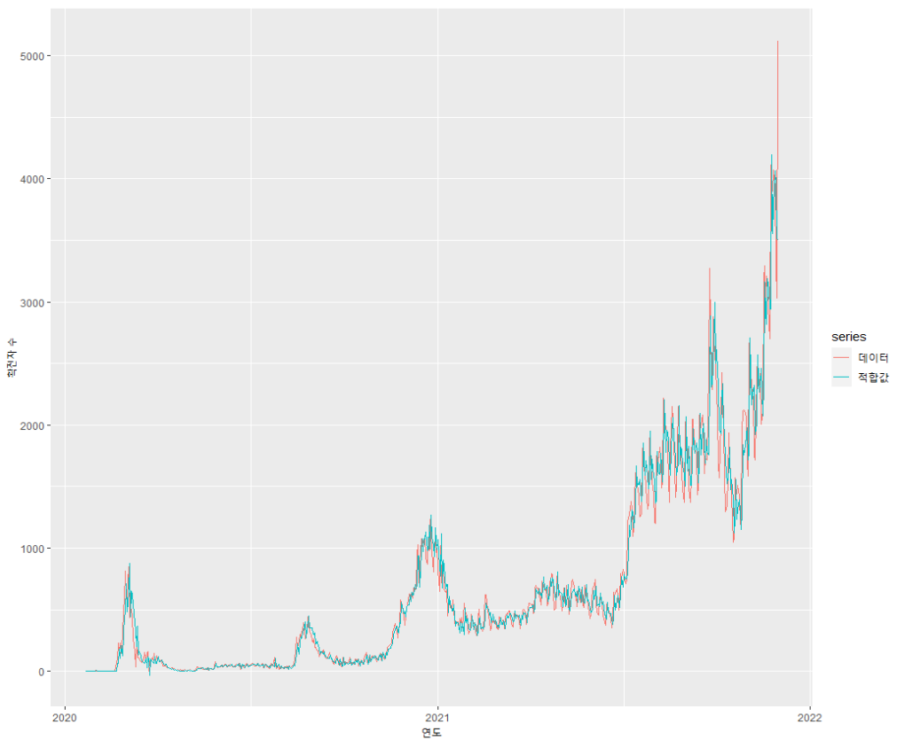
mod_d.result <- auto.arima(korea_ts, ic='aic')
summary(mod_d.result)

# actual vs. fitted 확인
autoplot(korea_ts, series = "데이터") + autolayer(fitted(mod_d.result), series = '적합값')

# 8분기 예측
fcast <- forecast(mod_d.result, 8)
autoplot(fcast) + xlab("연도") + ylab("확진자 수")
선형 모델을 만든 후 결과를 확인하였다.
auto.arima() 함수를 이용하여 선형 모형을 구현하였고, 최적의 모형은 ARIMA(2, 2, 2)로 나타났다.

기존 데이터와 ARIMA 모형으로 적합된 값을 시각화 하여 확인하였다.
fcast <- forecast(mod_d.result, 365.25/7)
autoplot(fcast) + xlab("연도") + ylab("확진자 수")
한국의 코로나 확진자 수 예측을 수행하였다.
예측 기간은 1주일(weekly)로 하였고, 결과는 확진자 수는 급증하는 것을 알 수 있다.

비선형 모형
※ 참고 ※
http://manishbarnwal.com/blog/2017/05/03/time_series_and_forecasting_using_R/
https://stackoverflow.com/questions/33128865/starting-a-daily-time-series-in-r
'분석가 Step 0. 자격증 > ADP' 카테고리의 다른 글
| [23회 실기] 기계학습 문제 풀이 1편 (0) | 2023.04.18 |
|---|---|
| [22회 실기] 기계학습 문제 풀이 (0) | 2023.04.13 |
| [20회 실기] 기계학습 문제 풀이 2편 (0) | 2023.03.28 |
| [20회 실기] 기계학습 문제 풀이 1편 (0) | 2023.03.27 |
| [17회 실기] 기계학습 문제 풀이 1편 (0) | 2023.03.23 |